Collecting data from global health and development projects is an important and necessary step for gathering insights, lessons learned and showcasing the impact of your work. However, wrapping up projects often means figuring out the best way to communicate a lot of complex data to different audiences. It’s common to find yourself confined by standard report formats which can be dry and not the best medium for engaging audiences, especially those less familiar with technical terms and detailed data analyses.
How can you communicate the “wow” factor of your work so it’s easy to understand and can be quickly accessed by various audiences? How can you put your project into a larger global picture? What are the best ways to turn data and statistics into engaging pieces for the public?
With the CanWaCH Analytics Portal, you can leverage our detailed analytics and maps to help tell the story of your work! Whether in your presentation or reporting, using fewer words and more visuals will help connect with audiences.
You can use downloadable visuals from our Analytics Portal or our custom map showing your organization’s work from the Project Explorer to communicate results, map out your next project steps, map out gaps and community needs and identify potential partners.
You can even take a deeper dive for your own reporting analyses; check out the Analytics Portal’s downloadable data files which include hundreds of current and closed projects. All our visuals and data are free and open source. We have also included methodological notes that explain how data was coded so you understand the assumptions we made and apply it to your own analyses and data use cases.
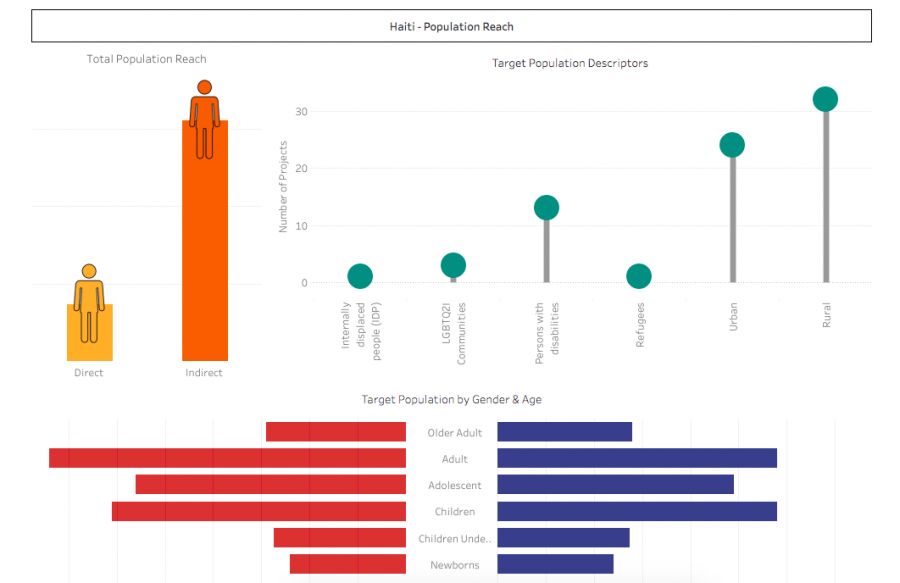
Already added your project to our Project Explorer? Then take advantage of your custom project page and use it as a communication toolfor your funders and partners. In one quick glance, the project page provides information on seventeen data fields that are of interest to diverse audiences.
From providing global snapshots of hundreds of projects available in the database, to zooming into individual custom project pages, there are multiple ways to learn from this data and to use it in your work!
Upskill your data storytelling in under three minutes with these quick videos on how to navigate the Analytics Portal, and pass them on to your colleagues!
This is the final blog in a special series on the Project Explorer. Read more on how to use this tool to connect with partners worldwide, and how to search for diverse projects. Have a question related to data, research, technology, or M&E? Share your question(s) with us and we will do our best to answer or connect you with those who can!


